The Best and Worst World Cup Kits: A Historical Evaluation
The task of ranking World Cup kits is undeniably complex. As the 2026 World Cup approaches, marking the 23rd tournament over 96 years, fashion trends have shifted dramatically. Among these, some kits have stood out for their aesthetic appeal, while others have missed the mark.
“Ranking the best and worst World Cup kits is impossible, given the overwhelming diversity and subjective nature of fashion preferences.”
The kits are more than just uniforms; they oftentimes embody memories of players, significant matches, and moments. Despite subjective opinions, here’s an expanded list featuring the best and worst World Cup kits. Feedback and opinions are welcomed.
The Best Kits
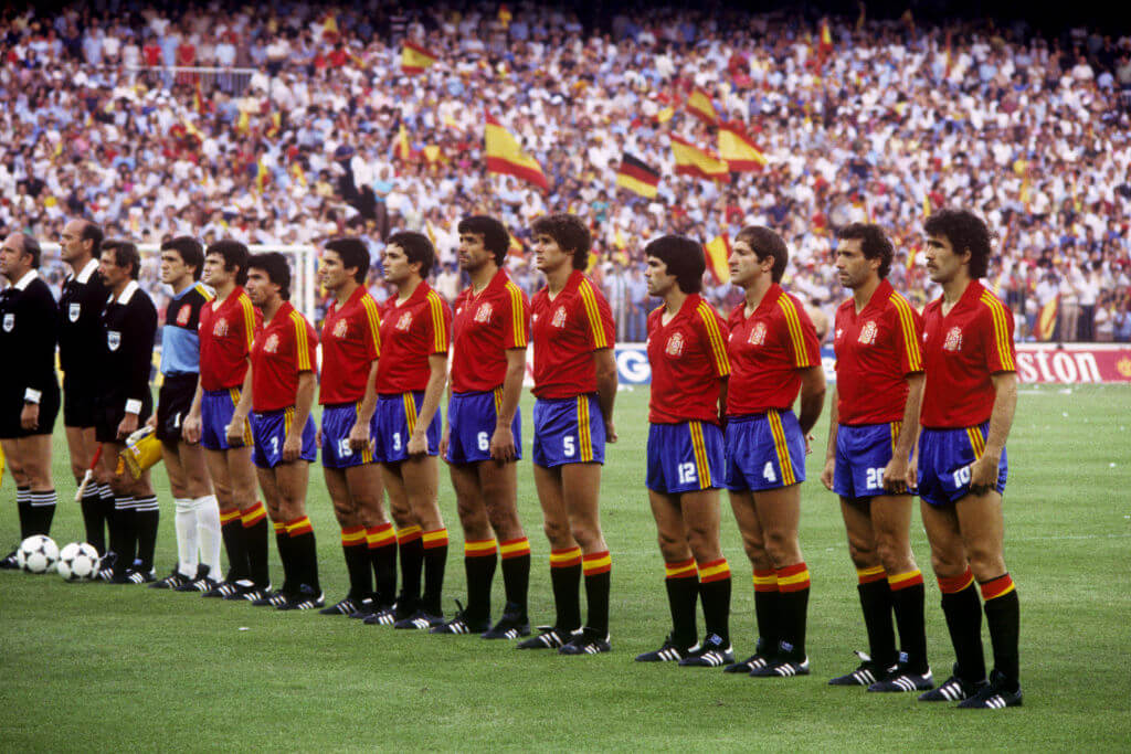
15. 1982 Spain (Home)
Spain hosted the 1982 World Cup with style. The classic Adidas ensemble was elegant, highlighted by a collared V-neck shirt in vibrant colors. While Spain finished 12th, the kit remains a quintessential representation of Spanish flair.
14. 2022 Portugal (Home)
Portugal’s uniform in 2022 showcased simplicity at best. Nike’s diagonally split color-blocking design was unique and visually striking, setting a potential standard for future kits.
13. 1998 Croatia (Home and Away)
Croatia’s checkered pattern achieved balance in 1998. The home kit integrated ample blank space to enhance its boldness, and the away kit creatively differentiated itself while retaining the checker theme.
12. 1994 U.S. (Away)
The ‘denim kit’ stirred controversy in American soccer fashion. Despite initial resistance, it is now embraced by fans and Adidas has even reintroduced it in various modern designs.
11. 2018 Japan (Home)
Japan elegantly refined their uniforms in 2018 with a dynamic shirt design accompanied by a fresh badge. Although their 1994 kit didn’t make it to the World Cup, 2018’s version represented Japan’s unique fashion ethos.
10. 1974 Netherlands (Home)
No excessive embellishments, just a vivid orange shirt complemented by a simple black badge. This kit brilliantly encapsulates the Netherlands’ distinct style and was iconic, especially with Johann Cruyff’s modified version.
9. 1990 Colombia (Home)
Colombia’s bright yellow shirt coupled with winged red and blue shoulders defines the essence of a sunny World Cup day. Carlos Valderrama’s iconic hairstyle amplified this standout kit.
8. 1982 England (Home)
England’s kits are traditionally understated, but the striking design by Admiral in 1982 broke the mold. Identifiably English yet intriguingly inventive, it stands out decades later.
7. 2026 Norway (Home)
The recent Norway kit is instantly appealing, drawing inspiration from past designs while boldly introducing Norse-themed graphics. The balance between classic and modern elements is impressive.
6. 2018 Nigeria (Home)
Nigeria’s kit broke sales records and became a cultural phenomenon, influencing design creativity and gaining global recognition despite the team’s early exit from the tournament.
5. 1994 Mexico (Goalkeeper)
Jorge Campos’ unique goalkeeper kits in the 1994 World Cup are unforgettable due to their bold neon colors, crafted with input from him. They epitomize mid-1990s fashion eccentricity.
4. 1986 Argentina (Home)
Simple yet magnificent, featuring classic blue and white stripes. The 1986 kit is synonymous with Maradona and stands as a testament to Argentina’s storied football legacy.
3. 1986 Brazil (Home)
Brazil’s 1986 kit proudly showcases the Jules Rimet Trophy within the badge, symbolizing their historic World Cup achievements. The iconic yellow and green color scheme further mirrors Brazil’s football pride.
2. 1998 Mexico (Home)
The Aztec-inspired design of Mexico’s kit is unforgettable, creatively integrating cultural elements with striking bright colors. Its influence is evident in Mexico’s latest designs.
1. 1990 West Germany (Home)
Timeless and universally cherished, West Germany’s 1990 shirt leaves a lasting impression. An iconic era-defining kit embodying greatness, despite the team’s notable success.
The Worst Kits
10. 2002 Brazil (Home)
Despite Brazil’s triumph in 2002, the peculiar green jagged designs made this kit visually unappealing. The team’s prowess overshadowed, but did not redeem this fashion misstep.
9. 2022 U.S. (Home)
A bland template and oddly placed neckline design diminish the aesthetic appeal of this kit. Hopefully, future American designs will better capture vibrant national symbols.
8. 1994 U.S. (Away)
The denim look stirred mixed reactions, yet its quirky charm is undeniable among some fans, highlighting personal taste variations.
7. 1994 Nigeria (Away)
Extending shirt patterns to shorts often results in fashion overload, as demonstrated by Nigeria’s 1994 ensemble.
6. 1994 Russia (Away)
The erratic design patterns of Russia’s kit contributed to perceptions of fashion chaos during the tournament, undermining team representation.
5. 2022 Switzerland (Away)
Puma’s monotonous template in 2022 turned Switzerland’s kit into a lackluster piece. The central design elements echoed misplaced style decisions.
4. 1982 Belgium (Home)
An inherently bizarre look, resembling caution tape or fictitious suspenders. The kit extended poor design choices onto the shorts.
3. 2026 Switzerland (Away)
Switzerland’s perplexing fluorescent splotches suggest mishaps or design malfunctions, enhancing the unsettling perception.
2. 1994 Netherlands (Goalkeeper)
Its visual chaos created a spectacle reminiscent of misguided 90s decor, casting Ed de Goey in a questionable fashion limelight.
1. 1930 Bolivia
Bolivia’s original uniform in tribute to hosts Uruguay was confusingly composed and impractical, leading to overt national confusion in the inaugural tournament.